MOXA Technologies

Trusted Image for a Leading Brand in Industrial Networking Industry

§

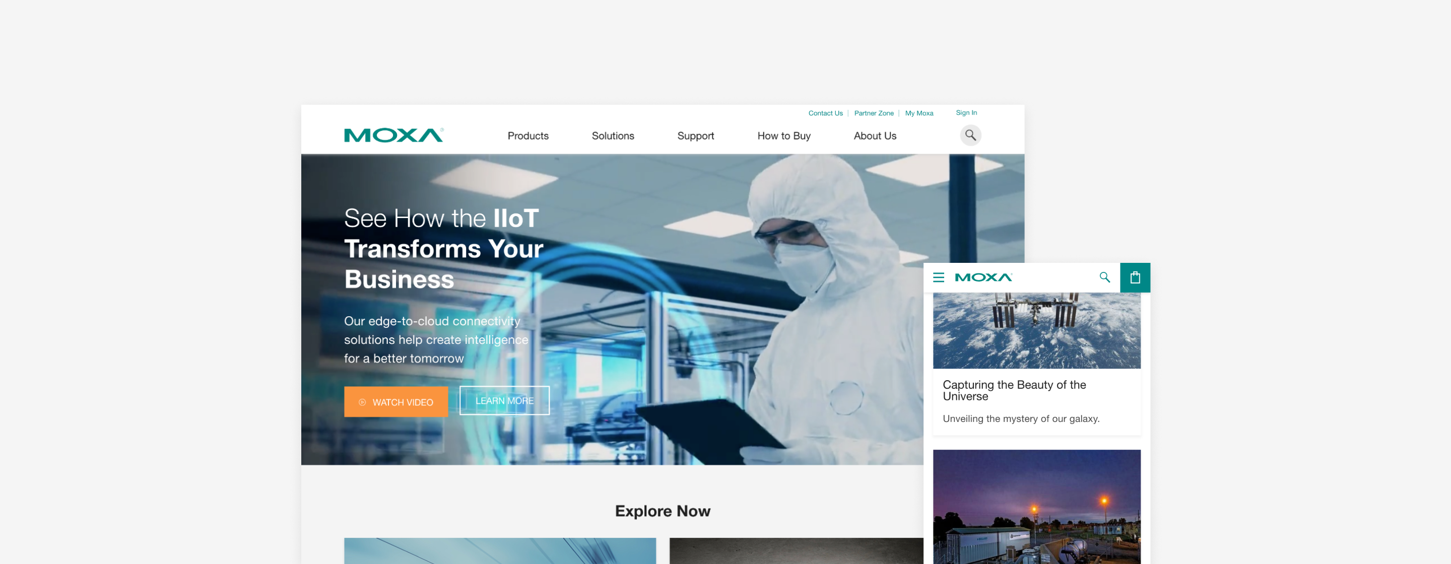
CONTEXT  Founded in Taiwan for more than 30 years, Moxa is a leading provider of industrial networking, computing, and automation solutions to help customers enable connectivity for the Industrial Internet of Technology (IIoT). Before this project, we had worked on some campaign landing page for Moxa. This time, they want to achieve a greater goal - revamping the original official website, integrating all the information, products, and PR contents on the new site. We aim to give the brand a new digital image with consistent language across the company and improve the experience to fulfill customers' needs to increase the conversion rate.

CHALLENGE  You can tell by the product line that Moxa is a big corporation like SiemensCisco, or HPE. It certainly took more time to communicate with different sectors. We even need to have final confirmation of the homepage design from the senior management. That's the main reason why it took more than a year for the implementation. Speaking of industrial networking, it is not a simple field to understand. Luckily, our client is more than willing to guide us that industry knowledge along the way.

Timeline
Aug 2017 - Jan 2019 (7 months in design)
Team
Designer (2), Art Director (1), Product Manager (1), Front-end Developers (3)
My role
Competitive Analysis, Wireframe, Information Architecture, Design Proposal, UI/UX Design, Web Design
· · ·
DESIGN HIGHLIGHT
The Importance of Information Archtecture
Imagine how many things around you connect to the internet. There are mobile, subway, electricity, and even shipping. We need a robust information structure to explain the application to the industry well to Moxa's customers. By grouping relevant information, considering the needs and easy access to products, the solution is to help customers digest the content with iconography and interactive layout. Everyone can enjoy the reading and understanding better what Moxa could do for them.
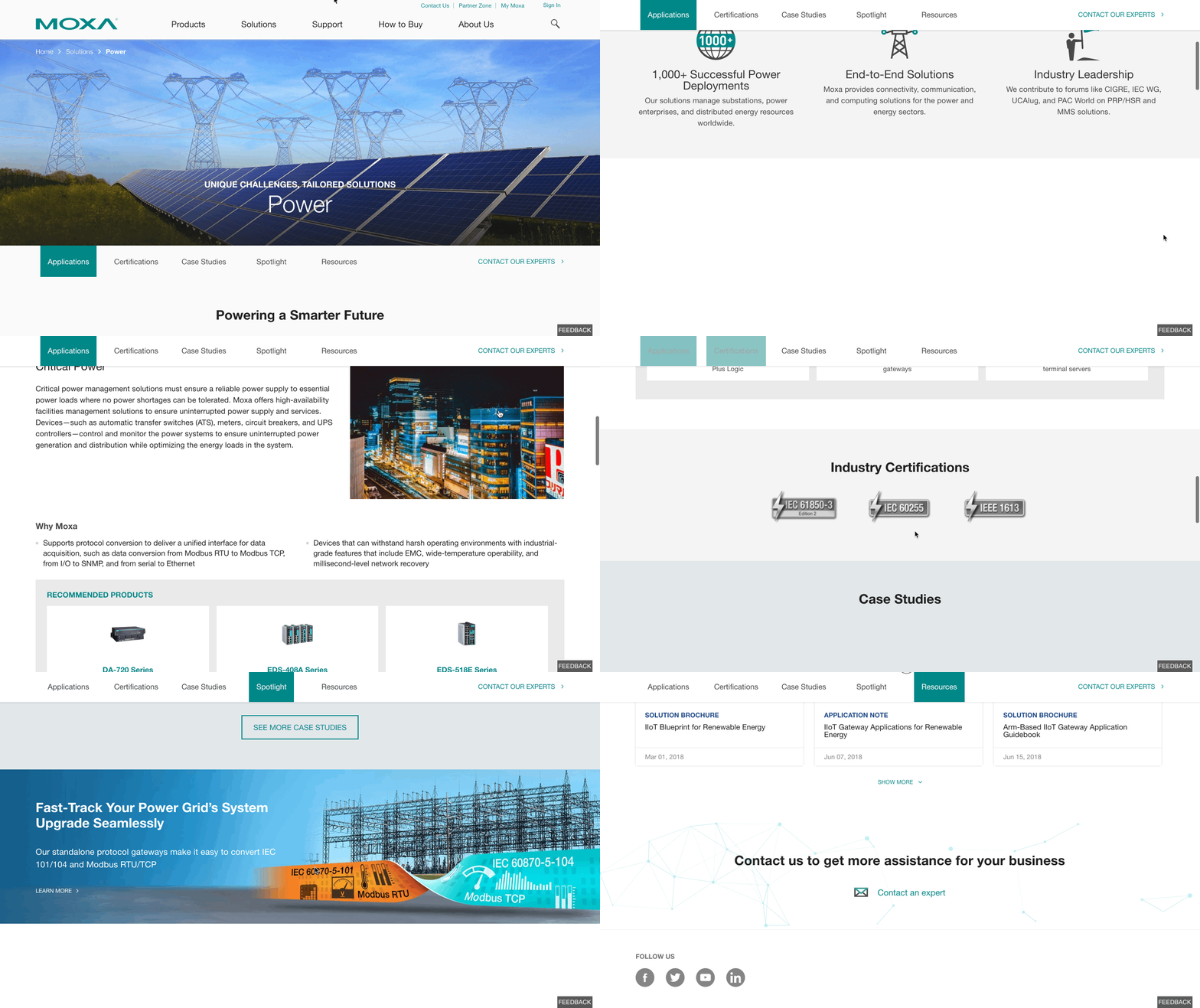
I define a structure to accommodate content from different industries. There are manufacturing, rail, power, oil, marine, and transportation.
PROTOTYPE
Little Tricky to Design a Search Function with Details
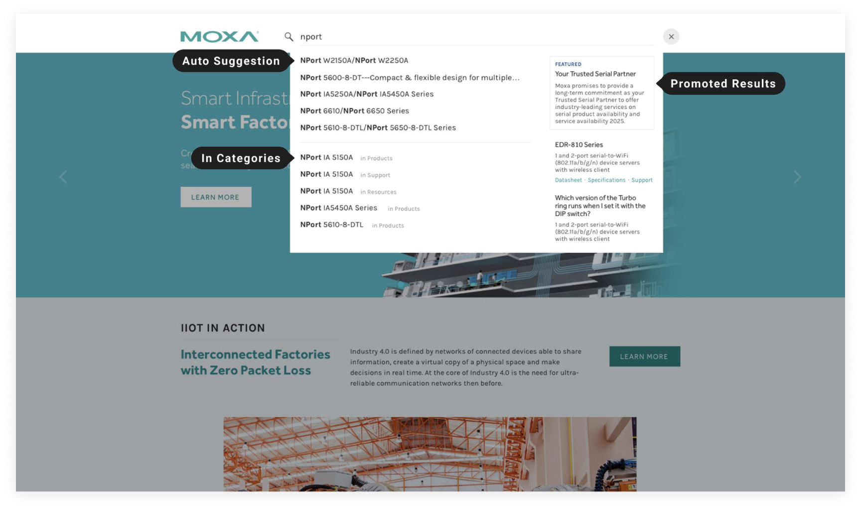
In the beginning, I did not realize it is a challenge to design the search function. However, since Moxa has tons of products and they have many types of customers. It is a critical part of the website to fulfill sales, marketing specialists, and engineers' needs. Speaking of design, we put much effort into the interaction and the connection between the search function and the page. I have to admit that it was my first time surfing on tons of websites looking for references on search. Lastly, I delivered three versions with a different angle of design. We finally published a solution with many details. Users can easily find their needs with such a friendly experience with auto-suggestions and promoted results.
The final solution

Reflection

· · ·
What I learned most during this project is to simplify complicated information into valuable knowledge. We worked seamlessly with the client for almost two years. I appreciate that our clients work as hard as we as designers. Their feedback always makes me think about how we could do our best to solve the pain points, which applicable to 99% of the case. We do not easily give up finding out the best solution. Finally, together we completed a website that contains a thoughtful user experience, assisting sales efficiency and digital imagery that clients can trust. I was satisfied with the outcome and the relationship we built with the client.
THE PROCESS / 01
Research, Understand & Define
· · ·
WEBSITE ANALYSIS
Understand the Business and the Users
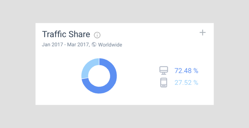
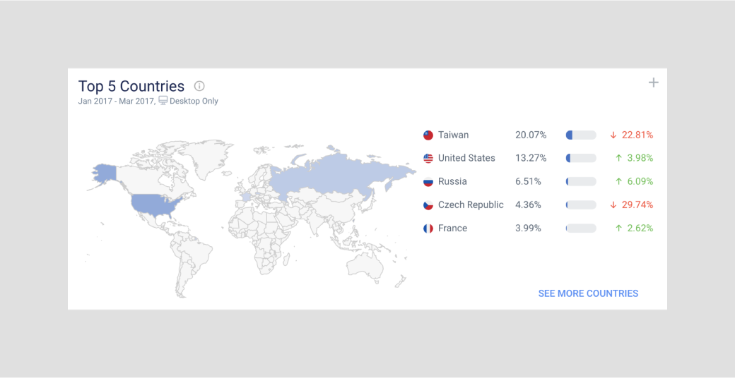
During the kickoff, we used an online tool, Similar Web, to analyze the original website. We found out over 70% of users view the website by desktop, and 42% of the traffic comes from the direct channel. According to our client, most users are engineers & sales, who usually check the Moxa website in the office for business purposes. Beyond that, the new website will only focus on the English language. It should be ready to face the global market.
COMPETITIVE ANALYSIS
Define the Look & Feel as an International Enterprise
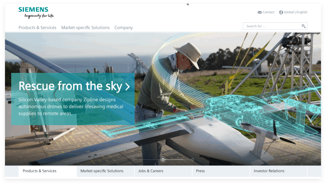
During the research phase, I checked many competitor websites like Cisco, Siemens & ABB. Their digital branding is not in a fancy or aesthetic style but focuses on the product and solution they offer. The most critical part is to explain their service clearly, which allows users easy to find their needs.
Siemens is the largest industrial manufacturing company in Europe.
Cisco develops, manufactures, and sells networking hardware and other high-technology services and products.
RESEARCH
Clarify the Function of the Website Fundamentally
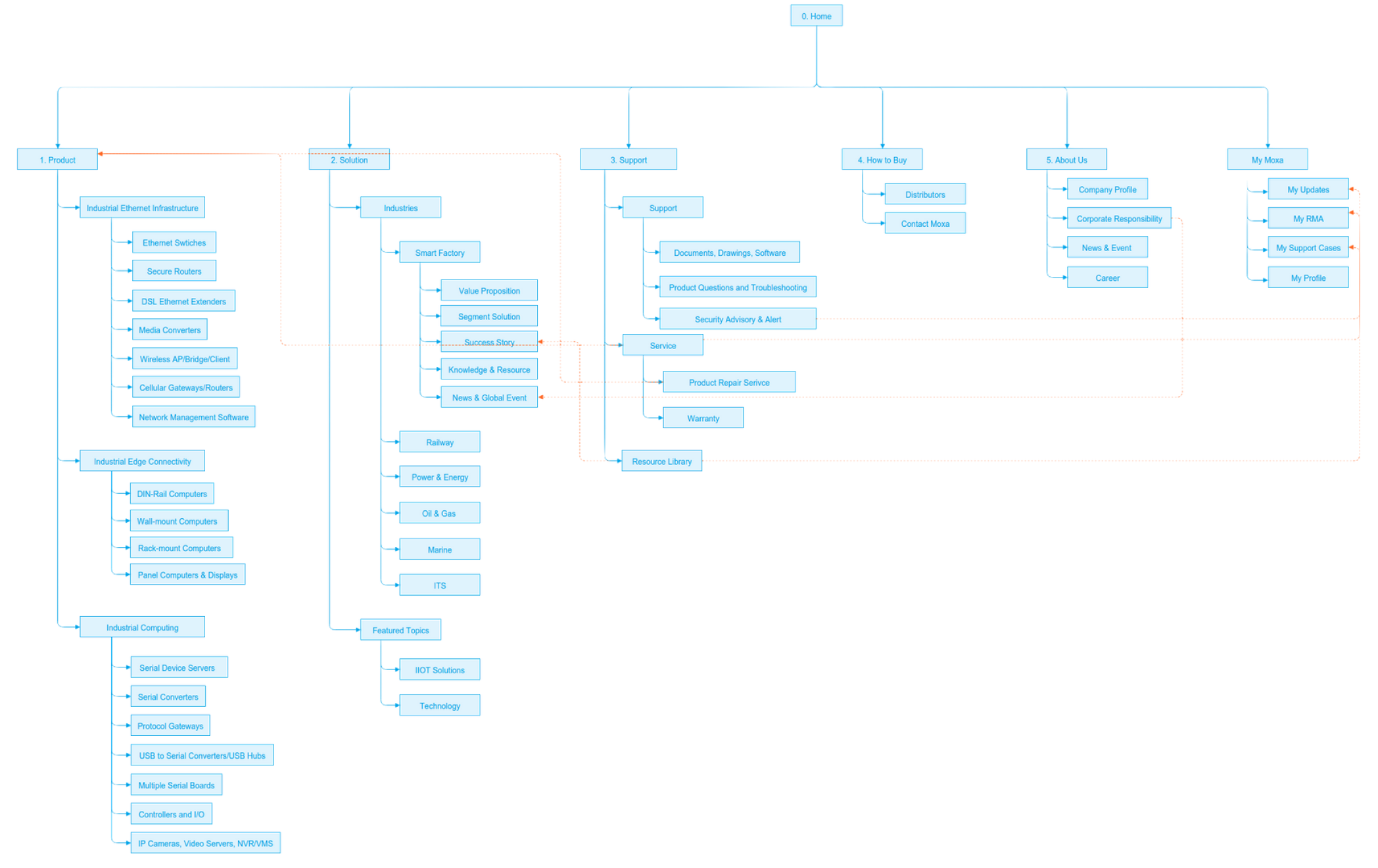
Every website starts from a site map, which is a clear picture to identify the project focus and analyze the scope. Moxa has six main parts, which also means six departments to define the angle and business purpose. Our mission is to integrate all the ideas and vision and deliver them into a consistent brand identity and user experience.
The site map
DESIGN PROPOSAL & INTERVIEW
Reveal the Key Factor behind the curtain
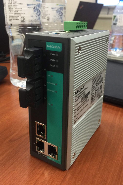
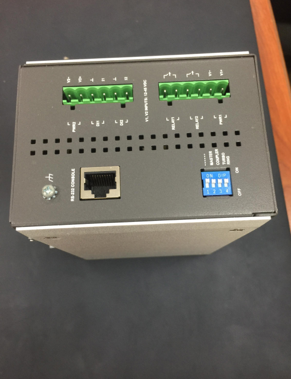
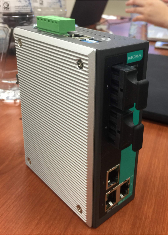
At the beginning of the design phase, we have half-day discussion sessions with some departments. It was a great chance to understand Moxa better with direct feedback. That was also our first time seeing the actual product that Moxa develops and produces, which is hard for a designer to imagine. I feel it's not a cold object but a functional helper to improve our life everywhere around us.
THE PROCESS / 02
Design & Iterate
· · ·
MOCKUP
An Accessible Product Finder
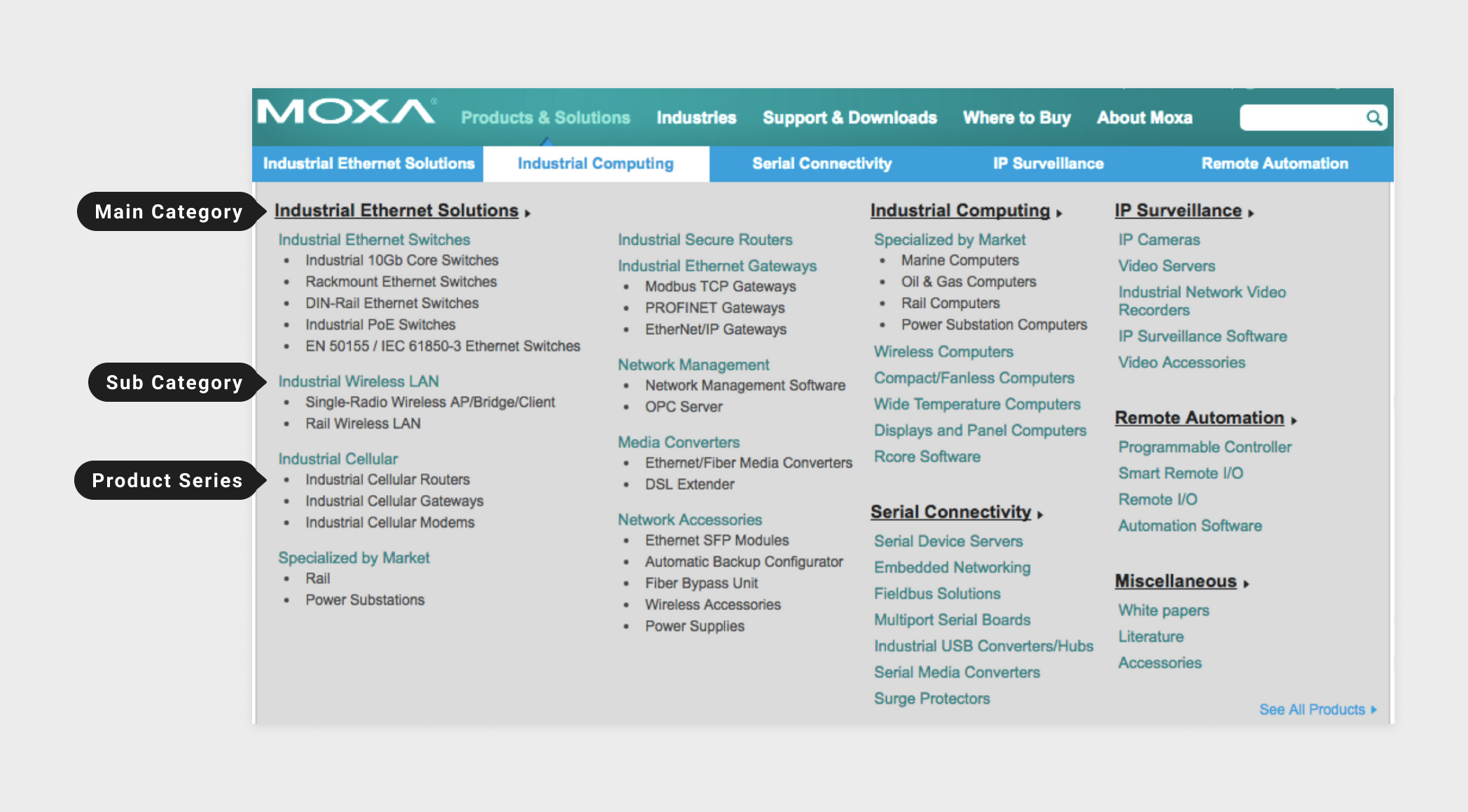
As you can see, the original information architecture of the menu was a bit messy. There are six categories and several sub-categories under the product section, which is hard to find the specific product. It is frustrated to see such a menu like this. The solution is organizing all the products into three main categories, that users can check the main category first then find out the products and more details after clicking on the page. There is also an index page to search products in their preferred ways.
The original product menu with three layers and the hierarchy of each other is ambiguous.
MOTION GRAPHICS
How IIoT connect with the Industries
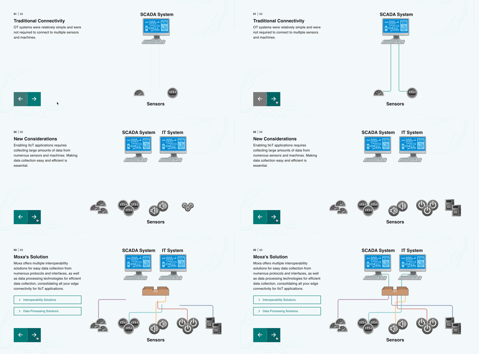
With the increasing trend of the industrial Internet of Things (IIoT), Moxa wants to highlight this rising star. To better explain the application to different industries and areas, we worked on some motion graphics to make customers easily imagine the process to solutions.
“How IIoT improve the process to collect your data?”
· · ·
ICONOGRAPHY DESIGN
Strengthen the Tedious content with Creative
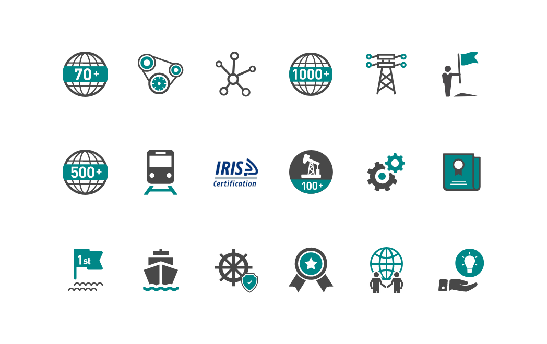
We tried many approaches to balance the rich content and simplify the complexity of the industrial industry. I designed several icons to express the content straightforward. They can represent an abstract idea or broader knowledge.
The simple version of icons stand for a single idea.
· · ·